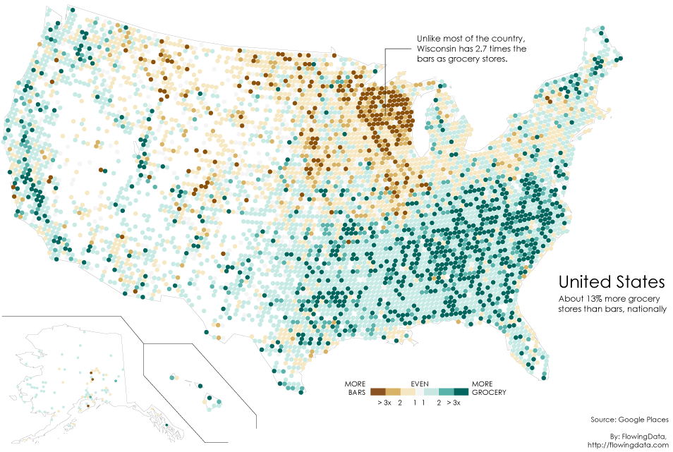
I grew up in Milwaukee, so this is no surprise to me, but via Flowing Data, below is a map showing the bar to grocery store ratio. Green means more grocery stores, brown means more bars.
The big brown area is basically Wisconsin.
I grew up in Milwaukee, so this is no surprise to me, but via Flowing Data, below is a map showing the bar to grocery store ratio. Green means more grocery stores, brown means more bars.
The big brown area is basically Wisconsin.

Leave a comment